Exaggerated Typography: Communicating Brand Personality Through Bold Design
In the fast-paced world of web design, capturing user attention immediately is a monumental challenge for any brand. Businesses consistently struggle to make a lasting first impression in an overcrowded digital landscape where visitors make subconscious judgements in fractions of a second. One of the most effective strategies to overcome this hurdle is the deliberate deployment of exaggerated typography. By elevating text from a simple medium of communication to a dominant visual element, designers can instantly project a distinct personality and establish immediate industry authority. The following exploration delves into the mechanics of using oversized bold fonts to command attention, streamline informational hierarchy and ultimately build unforgettable digital identities.

Capturing Fleeting User Attention
In our industry experience working with various organisations, we constantly see clients struggling to make a strong first impression on their digital platforms. It is a common challenge to immediately engage visitors who are inundated with countless digital experiences every day. According to a seminal study published in Behaviour and Information Technology, users form an opinion about a website in just 50 milliseconds. This incredibly brief window leaves almost no room for subtle design cues to take effect before the user makes a subconscious judgement. Consequently, web designers must deploy bold visual strategies to arrest attention instantly. Exaggerated typography serves this exact purpose by filling the screen with undeniable visual weight. Large text dominates the initial viewport to ensure that the core brand message is the very first element the eye processes. By expanding the scale of foundational text, designers create an inescapable focal point that prevents the user from aimlessly scanning the page.
Example: upgreight. (2026).
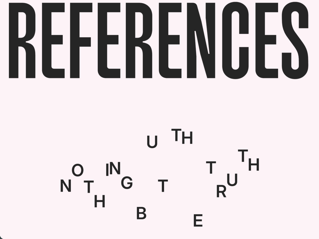
upgreight. (2026). Horeca Social: Made Viral. Awwwards. Retrieved from https://www.awwwards.com/inspiration/typography-driven-layout-built-to-reveal-bold-statements-through-motion-horeca-social-made-viral
Communicating Immediate Brand Personality
Beyond simply grabbing attention, oversized fonts carry immense expressive potential that dictates the entire mood of a digital interface. We frequently notice that businesses rely too heavily on stock imagery or complex illustrations to convey their identity when a carefully chosen typeface could achieve the same goal with greater elegance. A heavyweight serif font stretched across the hero section instantly communicates tradition and authority. Conversely, a massive geometric sans-serif typeface projects a modern and utilitarian aesthetic. The sheer size of these letters transforms them from mere readable content into structural art pieces that define the spatial parameters of the website. When typography is exaggerated to this degree, the microscopic details of the letterforms become magnified. The curve of a descender or the sharpness of a terminal becomes a prominent design feature that speaks volumes about the brand’s meticulousness. This approach allows the text to function simultaneously as the message and the primary visual asset.
Example: Sigma Software Design. (2026).
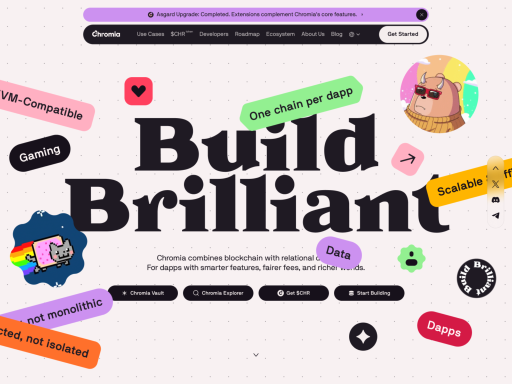
Sigma Software Design. (2026). Chromia. Awwwards. Retrieved from https://www.awwwards.com/sites/chromia
Moving Beyond Safe Aesthetic Choices
A recurring theme in our agency’s consultations is a client’s hesitation to depart from conventional design norms. Many brands default to standard font sizes paired with generic hero images because they fear alienating their audience with anything too avant-garde. However, playing it safe often results in a digital presence that entirely fades into the background. Exaggerated typography forces a departure from these predictable layouts by demanding space and commanding the layout’s grid. When text sizes exceed traditional limits, the designer must rethink the standard placement of navigation menus and secondary content. This disruption of the norm is precisely what makes a website memorable. Instead of blending into a sea of identical corporate sites, a platform utilising massive typography establishes itself as confident and distinctive. It signals to the visitor that the brand does not need to hide behind decorative clutter to make a compelling point.
Example: Buzzworthy & Juraj Molnár. (2025).
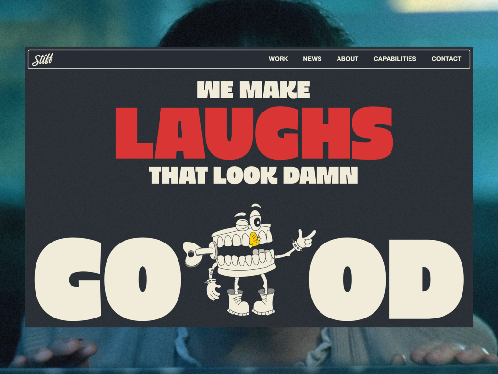
Buzzworthy & Juraj Molnár. (2025). Working Stiff Films. Awwwards. Retrieved from https://www.awwwards.com/sites/working-stiff-films
Establishing Hierarchy Through Scale
One of the most practical benefits we observe when implementing oversized typography is the absolute clarity it brings to the informational hierarchy. When users visit a new website, they typically scan the content to understand the value proposition before committing to a deeper dive. By escalating the size of the most crucial headline, designers remove any ambiguity about where the reader should focus their attention. The exaggerated scale automatically pushes secondary information into a supporting role. This extreme contrast in text sizes guides the user’s eye naturally down the page in a predetermined sequence. We find that this method is particularly effective for brands that have complex service offerings or intricate corporate histories. By stripping away visual noise and relying on massive textual anchors, the design ensures that the most critical narrative elements are digested first. The scale alone dictates the flow of information without the need for excessive framing or bounding boxes.
Balancing Expressiveness with Accessibility
While pushing the boundaries of scale offers remarkable aesthetic rewards, our web design projects also highlight the critical need to maintain functional accessibility. Exaggerated typography can easily cross the line from striking to illegible if not handled with rigorous technical care. When fonts are scaled up drastically, the spacing between lines and individual letters requires meticulous adjustment to prevent the characters from bleeding into one another. We always advise that contrast ratios remain a top priority when deploying massive text blocks over coloured backgrounds or dynamic video elements. The expressive nature of a giant font must never compromise the user’s ability to actually read the core message. Furthermore, designers must implement fluid typography systems that scale intelligently across different devices. A headline that looks breathtakingly dominant on a 4K monitor must gracefully adapt to a mobile screen without breaking words awkwardly or pushing essential navigation out of reach.
Typography as the Primary Visual Element
Through our extensive work in building digital identities, we have come to champion the idea that typography can and should stand alone as the primary visual driver of a website. Clients often approach us under the assumption that they need extensive photoshoots to create an engaging homepage. We consistently demonstrate that beautifully typeset words can carry the entire emotional weight of a campaign. When designers treat text as shapes and structural forms, they can construct dynamic compositions using negative space and typographic tension. This minimalist yet impactful approach reduces page load times and streamlines the development process while delivering a highly sophisticated end product. It allows the brand’s literal voice to take centre stage.
Thanks for reading!
This article is part of our Marketing Knowledge series, where we share practical insights from our daily work in web design, branding and digital content. If you’d like to explore related topics, see all articles in our Marketing Knowledge section.
Frequently Asked Questions: Typography in Web Design
Can oversized fonts negatively affect a website's loading speed?
Using large text instead of heavy raster images or complex video backgrounds can actually significantly improve your page loading times and overall site performance. Web fonts are generally lightweight files compared to high-resolution photographs or interactive multimedia elements that typically populate modern homepages. By relying on typography as the primary visual driver, we can build striking digital experiences that remain incredibly fast to load across all network conditions. This streamlined approach provides a vastly superior user experience and yields noticeable benefits for search engine optimisation.
How do we choose the right bold typeface to match our brand personality?
Selecting the appropriate typeface is an intricate process that demands a deep understanding of your brand's core values and target audience. We often help clients navigate this overwhelming choice by first identifying whether they want to project traditional authority with a heavyweight serif font or a distinctly modern aesthetic with a clean geometric sans-serif option. It is crucial to test how these specific fonts render at massive scales because the microscopic details of the letterforms become highly visible structural elements. The sharp terminals or the sweeping curves of a giant letter will dictate the entire mood of the interface and serve as the foundational building blocks of your new digital identity.
About Black Cliff Media
We’re a UK-based creative agency specialising in video production, website design and development, branding and visual content. Every article we publish is reviewed by our team to make sure it reflects our real project experience, so it is not just theory.
If you’d like to see how we apply these ideas in real client work, check out our latest projects.


")
")