Beyond the One-Off: Why B2B Tech Brands Must Embrace Series Design
In the highly competitive B2B technology sector marketing leaders frequently face a frustrating paradox. Organisations invest heavily in top-tier copywriting, secure input from leading subject matter experts and commission striking visual assets for their latest product launches or campaign initiatives. Yet when these materials are deployed across the broader market, the expected cumulative brand impact often fails to materialise. Instead of building a highly recognisable and authoritative presence, the company assets feel fragmented. The website, the LinkedIn feed, the sales presentations and the physical event materials look as though they belong to entirely different businesses.
We regularly observe B2B tech companies invest substantial budgets in beautiful standalone marketing materials only to struggle with profound brand dilution. Because their various digital platforms, sales collaterals and physical touchpoints feel completely disconnected, potential buyers fail to connect the dots between successive encounters. In an industry where purchase decisions are complex and require multiple brand touchpoints, this visual fragmentation acts as a friction point. To combat this issue, forward-thinking marketing teams are abandoning the practice of standalone asset creation. Instead they are embracing a methodology known as series design: a strategic approach rooted in visual repetition, systemic layout rules and interconnected graphic narratives.
The Cost of Fragmented Creativity
The Illusion of Standalone Excellence
When marketing teams evaluate a newly designed asset, they typically view it in isolation. A single PDF whitepaper on a designer’s monitor or a lone social media graphic inside an approval dashboard can look magnificent. However, this isolated review process creates an illusion of success. In the real world, prospects do not consume brand touchpoints in a vacuum. A prospect might see a graphic on their LinkedIn feed, read an article on a resource hub, receive a sales presentation from an account executive and eventually receive a welcome package. If each of these components is treated as a separate creative project with unique typography, colour variations and layout styles, the cumulative brand memory is shattered. The visual discontinuity forces the buyer’s brain to re-learn the brand identity during every single interaction.
The Mechanics of Brand Dilution
In the B2B tech space buying cycles are notoriously long, often involving multiple stakeholders who must reach consensus over several months. To build trust, a brand must establish a reliable, professional presence. When visual styling shifts unpredictably from one asset to the next, it signals a lack of internal alignment and operational maturity. If your brand looks disjointed, prospects may subconsciously assume your software platform or service delivery is equally fragmented. Brand dilution occurs when the visual cues that should trigger instant recognition instead trigger cognitive load. Without consistency, your marketing budget is effectively spent on reintroducing your brand to the same prospect over and over again, rather than reinforcing a singular, cohesive identity.
Moving from Campaign Thinking to Ecosystem Design
To break this cycle, marketing departments must shift their mindset from short-term campaign outputs to long-term ecosystem design. Standalone campaign thinking prioritises novelty over continuity, frequently leading to the creation of disposable visual assets that serve a brief purpose before being retired. Ecosystem design, by contrast, focuses on building a flexible, enduring system of visual blocks. Series design dictates that every newly commissioned asset must be designed as an extension of an existing family. This approach does not stifle creativity; rather, it channels creative energy into defining the rules of a shared universe, ensuring that every asset produced acts as a compounding investment in brand equity.
Designing the Continuous LinkedIn Feed Experience
LinkedIn is the primary digital battleground for B2B tech marketers, yet most company feeds are a chaotic mixture of corporate headshots, generic stock graphics and mismatched promotional banners. Because posts on LinkedIn appear individually in a vertical, chronological feed, publishing disconnected visuals creates erratic brand noise. To cut through this distraction, forward-thinking B2B organisations construct distinct visual content franchises. By establishing recurring template systems for specific types of posts (such as technical data insights, product updates or industry commentary) the company transforms its feed into a cohesive visual ecosystem where every post reinforces the same structural identity.
The Continuous Horizontal Canvas of Multi-Slide Carousels
While the LinkedIn feed itself displays posts vertically, multi-slide document carousels offer B2B marketers a powerful horizontal canvas. Designing carousels using series design principles means treating all slides as a single, uninterrupted graphic landscape. Designers extend abstract interface lines, typographic elements and subtle background gradients across slide boundaries so that the right edge of slide one flows smoothly into the left edge of slide two. This continuous horizontal flow creates a seamless reading experience that prompts higher engagement and encourages prospects to swipe through the entire document.
Maximising Recall in Fast-Moving Feeds
When an individual post or carousel appears in a prospect’s LinkedIn feed, its structural consistency immediately signals ownership. Fixed typographic margins, consistent image framing devices and disciplined colour palettes train the prospect’s brain to recognise your brand instantly. Over time, decision-makers scrolling through their daily updates can identify your content during a rapid scroll, even before reading the logo or company name. This visual familiarity builds subconscious trust, securing an invaluable competitive advantage in an attention-scarce B2B marketplace.
Real-World Application: The Systemic Grids of Modern SaaS
We see this philosophy executed brilliantly by visual-first SaaS platforms like Figma and Miro. Their social media channels do not rely on random, one-off announcements. Instead, they operate on strict layout templates that connect their brand graphics. By setting standard border rules, using recurring layout containers and deploying consistent multi-slide carousel frameworks, they turn their corporate profiles into living design systems. The consistent framing ensures that every post feels familiar, reinforcing their identity as design-led organisations without requiring their creative teams to build every asset from scratch.
The Tactile Connection: Physical Onboarding and Client Kits
Translating Digital Identity into Tangible Touchpoints
As digital-first organisations, B2B technology companies often struggle to create physical touchpoints that feel as polished and sophisticated as their cloud platforms. This gap is particularly evident during the onboarding of remote employees or when welcoming premium enterprise SaaS clients. Physical kits containing company merchandise represent a rare, high-impact opportunity to anchor a digital brand in the physical world. However, sending a box of cheap, disconnected items with a stamped logo does little to foster brand affinity. The design philosophy of series design must be applied to physical assets to ensure they carry the same weight as digital tools.
The Puzzle Effect of Connected Merchandise
To create a truly memorable onboarding or client welcome experience, physical assets should be designed to fit together like pieces of an elegant puzzle. Imagine an onboarding kit where the exterior shipping container, the inner packaging tissue, the laptop sleeve, the notebook and the custom premium coffee mug all carry a unified visual language. Rather than simply applying a standard logo to pre-existing items, designers create an overarching visual pattern that wraps across the surfaces of the items. For example, a continuous abstract graphic can begin on the laptop sleeve, flow onto the spine of the notebook and conclude on the packaging material itself, encouraging the recipient to unbox the kit as an interactive, cinematic brand experience.
Fostering Belonging and Brand Advocacy
The psychological impact of receiving a beautifully designed, cohesive physical kit is immense. For remote employees, it provides a tangible link to a physical workplace, reinforcing a sense of belonging and professional pride. For high-value enterprise SaaS clients, it transforms an abstract software subscription into a premium, high-touch partnership. When the packaging and contents of a physical kit are designed with this level of consideration, they transcend utility. Recipients are far more likely to photograph the cohesive unboxing experience and share it on their personal social channels, turning physical onboarding kits into a powerful, organic B2B brand advocacy tool.
Real-World Success: Salesforce’s Onboarding Ecosystem
A masterclass in this physical-to-digital cohesion can be seen in Salesforce’s custom employee onboarding kits. The package functions as a single, integrated product experience where the box, greeting card and daily work essentials coordinate to reinforce the company identity. New hires regularly share these premium kits on social media as an organic badge of pride.

Pratibha Gurnani’s Salesforce Welcome Kit Post on LinkedIn
As seen in the Salesforce kit above, the individual pieces rely on strict adherence to the brand’s iconic corporate palette and mascot universe. Rather than shipping a random assortment of mismatched tech accessories and standard office stationery, Salesforce aligns the colour of the notebook, the thermal coffee cup, the ink pen, the wireless speaker and even the packaging insert to the exact same sky blue hex codes. Every piece features clean, centered cloud iconography or custom illustrations of their beloved Astro character. By using a highly structured, repeatable colour formula and logo placement guide, Salesforce creates an interactive experience that makes remote employees and premium enterprise clients feel deeply integrated into the company culture from their very first day.
Building a Unified Resource Library System
The Chaos of the Standard Resource Hub
Almost every B2B tech company maintains a digital resource hub populated with whitepapers, technical case studies, webinar recordings and ebook downloads. However, visiting these hubs often reveals a jarring aesthetic clash. Because these assets are produced over many months by different internal teams or external agencies, the covers and layouts are consistently mismatched. Some use dark photographic backgrounds, others use flat vector illustrations, whilst others rely entirely on typography. This visual disarray makes the resource hub look disorganised, casting doubt on the quality and authority of the research hosted within it.
Creating a Cohesive Cover Architecture
A unified digital library demands a highly structured, scalable cover architecture that enforces visual harmony whilst allowing for clear categorisation. This is achieved by developing a strict layout template that defines exact placements for typography, grid structures and visual motifs. For instance, whitepapers could use a clean, minimalist design with a dominant primary brand colour, while technical case studies utilise a secondary accent tone with structured wireframe graphics. When a user lands on the resource hub, the covers present themselves as a premium, curated collection of publications, resembling a professional library rather than a digital junk drawer.
Streamlining Content Production
While some marketing teams worry that a structured system restricts creative freedom, the operational reality is that it dramatically accelerates production. By establishing a predefined visual architecture, internal designers and external partners no longer waste time debating layout styles, colour palettes or font choices for every new piece of content. The visual rules are already written. This enables creative teams to focus entirely on layout perfection and content formatting, reducing production timelines from weeks to days. Ultimately, a cohesive series system minimises creative friction, allowing marketing operations to scale content delivery without sacrificing brand integrity.
Real-World Pioneers: Stripe Press and Intercom Book Design
The most prominent champions of this editorial library framework are Stripe Press and Intercom. When Stripe launched its publishing arm, Stripe Press, it rejected the standard approach of creating unique, standalone book covers for every title.
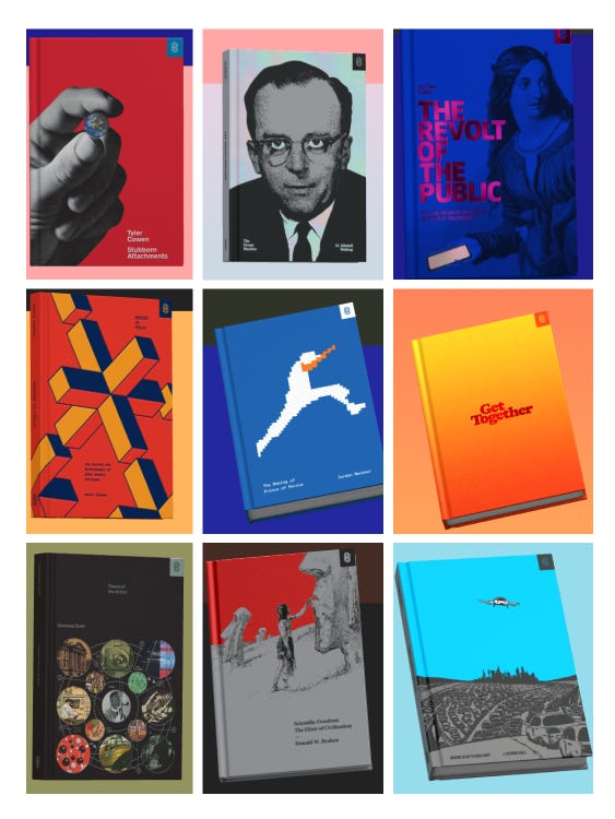
Image source: Failory
As demonstrated in the collection above, Stripe Press books share identical physical dimensions, unified margin structures, custom typographic systems and precise layout rules. Although each book features a unique central illustration, their shared visual DNA is instantly recognisable.
Similarly, the Intercom Brand Studio developed an unshakeable template for its famous guidebook series (such as Intercom on Product Management). Every cover features a thick, structured border, a fixed minimalist layout for typography and a whimsical, hand-drawn character illustration right in the centre. By displaying these books together on their digital resource hubs, both Stripe and Intercom convey immediate intellectual authority, turning standard content marketing into a highly respected library of industry knowledge.
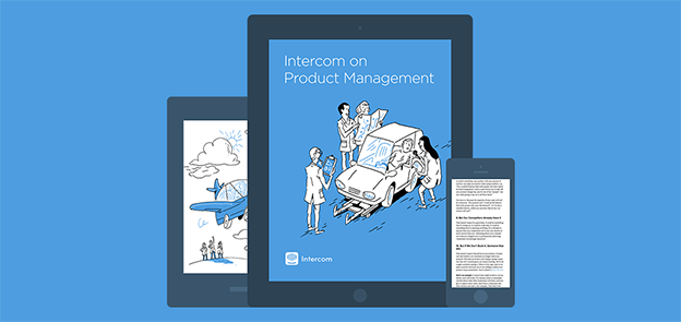
Image source: Intercom
Thanks for reading!
This article is part of our Marketing Knowledge series, where we share practical insights from our daily work in web design, branding and digital content. If you’d like to explore related topics, see all articles in our Marketing Knowledge section.
Frequently Asked Questions
How do we start transitioning from standalone asset creation to series design without halting our current marketing output?
Transitioning to series design does not require you to halt your active marketing campaigns. The most effective approach is to pilot the system on a single high-priority channel, such as your upcoming LinkedIn campaign or a new series of technical guides. Work with your creative partners to design a flexible visual framework for this pilot. Once this framework is polished and proven, you can document the visual guidelines and gradually apply the system to other channels as assets naturally come up for renewal or update.
How can we maintain visual consistency across channels when different teams handle social, physical collateral and web content?
Maintaining consistency across disparate teams requires moving away from static style guides toward dynamic, central design libraries. Establishing a centralised digital asset manager containing pre-built templates, approved colour tokens and layout components is essential. This ensures that whether a designer is building a digital banner, formatting an ebook or ordering client merchandise, they are drawing from the exact same source of truth. Regular cross-departmental visual reviews can also help identify and correct misalignments early.
Will adopting series design make our brand look repetitive and boring to our target audience?
This is a common concern, but series design relies on visual repetition of structural elements, not flat duplication of content. The system should define constant anchors, such as typography, grid structures and basic layout geometry, while allowing dynamic elements like central illustrations, copy and secondary accent colours to vary. This balance of consistency and variation keeps your marketing materials visually engaging while reinforcing a cohesive brand identity during every touchpoint.
How do we scale series design effectively when we have limited graphic design resources?
Series design is actually the most efficient path for small design teams. By designing a robust, component-based visual system upfront, you eliminate the need to design every new asset from scratch. Your design team can build reusable layout components, automated templates and predefined asset formats that marketing teams can easily populate. This approach drastically reduces the design hours required per asset, freeing up your creative resources to focus on high-value strategic design projects rather than repetitive production tasks.
About Black Cliff Media
We’re a UK-based creative agency specialising in video production, website design and development, branding and visual content. Every article we publish is reviewed by our team to make sure it reflects our real project experience, so it is not just theory.
If you’d like to see how we apply these ideas in real client work, check out our latest projects.