Case Study: Web Design. Rebranding Global Justice Network

Before a Web Design, Our Approach = Attention to Detail
Here at Black Cliff Media, we really take the time to get to know our clients inside and out. Before any project, we know to truly deliver meaningful solutions we have to first know and understand the pain-points that need to be resolved. By taking this approach it also allows us to really understand the core message that clients wish to communicate and the way in which they would like to project themselves to their target audience.
The Client – The Brief – (Re)balancing The Scales
The Global Justice Network (GJN) are an ensemble of highly skilled lawyers from around the globe – who are committed to their mission of providing legal services and applying these to the most challenging of cross-border claims.
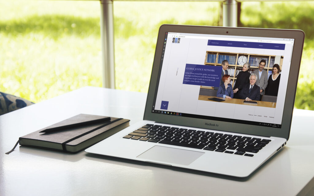
To accurately represent and champion this unique and dynamic collective powerhouse – a complete website overhaul was required. Black Cliff Media were asked to provide a fresh, new design. The earlier digital layout was barely functional and significantly outdated in terms of presentation and features. It solely relied upon its written content for user engagement and suffered from cluttered and difficult to navigate menus and layout. At it’s core the coding was buggy and lacked responsiveness. All of these aspects were in direct conflict with the brand image and values held by GJN.
A Clear Interpretation
Black Cliff Media worked in unison with GJN to suggest website features, layout and colour palette. Our web designers set to work to ensure both functionality and user experience. In order to bring a website that could effectively curate the source material and insights from the legal cases that the GJN were responsible for – creating a fresh, modern and aesthetically pleasing design that would bring the Network’s values closer to their intended audience was our objective.
Drawing Inspiration
Taking the ‘global’ from the ‘Global Justice Network’, provided a compelling motif for the web design and identity. The world map was used to signify the organisation’s diverse membership and wealth of expertise – as well as to emphasise their extended reach for handling international cases, something which they are uniquely equipped to undertake.
In addition, the ‘global’ design element was taken further to encompass the organisation’s ‘networked’ identity. We created a fully functional, interactive map under the Network menu – where all individual GJN member locations can be viewed. These individuals’ locations were accurately pinned – with member office addresses and contact details clearly visible. This was not only to add a level of design finesse and interactivity – but to embody and reflect the organisation’s rich network of experts and legal advisors – signposting this USP for visitors and users alike.
Improved Functionality: All Style & Substance
Reinforcing the aspect of a team effort – a key part of the new web design was the introduction of the members’ page, with individual portrait and bios of each member. These profiles represent the human side to Global Justice Network – allowing for a deeper, more personable connection with users and visitors alike. The photo gallery was engineered to accommodate both images and video content – with further scope for more demanding media to be showcased in the future.
But the new design of the website went beyond aesthetics and the overall feel of the web design. Behind this re-imagining of the brand, we created a fully responsive platform, built from the ground up with both mobile and small-screen device users in mind, as well as desktop users. Heavily boosted website performance was achieved by our developers – who improved website loading speeds and took advantage of using the latest WordPress engine add-ons to ensure the greatest stability and security.
Adding Long-term Value
As with the constantly evolving nature of cases and projects that the GJN work on, it was vital that the new re-build of the website would be intuitive, allowing for in-house updates to be carried out as required – both immediately and for the future. An easy-to-use admin feature was created to allow for this, granting administrators creative freedom that was straight-forward to apply – making adjustments to fonts, colours and the inclusion of media content a hassle-free process.
See the website here.


