How Interactive Editorial Layouts Reshape Brand Authority
In our experience working with tech, high-growth SaaS and IT consultancy brands, we frequently observe a frustrating paradox. A company will spend months conducting original research, aggregating telemetry data and compiling a brilliant state-of-the-industry report. They employ top-tier developer advocates and technical writers to map out complex architectures, data frameworks and strategic insights. Yet, when this highly valuable thought leadership is finally published, it is simply dumped into a generic, static blog template or hidden behind a clunky PDF download gate. The final presentation looks exactly like a standard piece of documentation, completely failing to reflect the innovative, cutting-edge nature of the technology itself.
When deep technical insights are presented through a rigid and uninspired interface, busy decision-makers such as CTOs, CIOs and engineering leaders quickly lose interest. These sophisticated B2B buyers deal with information overload daily and expect an experience that respects their time while holding their attention. Capturing this scarce cognitive bandwidth requires moving away from the predictable layouts of corporate tech blogs and embracing interactive digital editorial layouts that elevate technical writing into a compelling visual narrative.
The Disconnect Between Technical Innovation and Content Presentation
Standard Tech Blog Grid Limitations
In our daily collaborations with marketing directors and product leaders in the IT sector, we regularly see brilliant content strategies fall flat because of template constraints. Many technology firms treat their digital publication layer as an afterthought, relying on standard content management systems that force text into uniform, narrow blocks.
This approach assumes that a reader is motivated purely by the raw data on the screen. In reality, establishing market authority in the tech space relies heavily on demonstrating engineering and design maturity. When sophisticated architecture breakdowns are forced into a flat template with no visual pacing, the brand unintentionally signals that its ideas are ordinary and transactional.
High Cost of Cognitive Fatigue in B2B Tech
The modern buyer prioritises clarity and engagement across every digital touchpoint. When a website relies on predictable scrolling patterns and uninspired formatting to convey highly technical concepts, it creates immediate cognitive fatigue.
We find that IT brands often wonder why their whitepapers have high bounce rates despite their substantial production budgets. The answer usually lies in the lack of visual rewards within the user interface. Without subtle interactions, intentional white space or dynamic shifts in layout scale, long-form technical articles become intimidating walls of code and text. To establish true sector authority, the digital medium must actively match the exceptional quality of the engineering insights within the piece.
Elevating Technical Authority Through Interactive Storytelling
Translating Complex Data into Interactive Narratives
Interactive digital editorial design allows a tech brand to control the rhythm of information delivery. By utilising scroll-driven animations, dynamic data visualisations and expandable code blocks, the interface guides the reader through complex concepts in a digestible sequence.
Example in Action: Clerk
Look at how the authentication platform Clerk explains its complex integration architecture. Instead of relying on static documentation or standard blog formats, their platform utilises true scroll-driven storytelling. As the reader scrolls, the layout locks in place, allowing the scrollbar to directly control the progression of a technical deployment. The backend code builds itself line by line on one side of the screen while the corresponding frontend user interface updates in perfect synchronisation on the other, transforming a dry architectural breakdown into an engaging visual narrative.
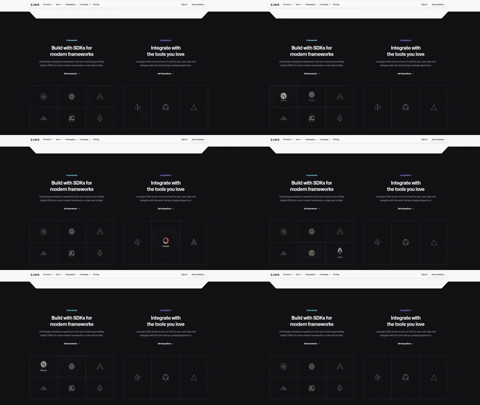
For illustrative purposes only. Clerk and its user interface are trademarks of Clerk, Inc. Source: clerk.com
Signalling Engineering and Design Excellence
A technology or IT company cannot credibly claim to drive innovation if its own digital footprint looks archaic. Custom editorial layouts act as a visual proof of technical capability and attention to detail.
When a brand invests in bespoke typography, tailored multimedia integration and flawless layout transitions, it demonstrates a commitment to operational excellence. This level of design execution builds immediate trust with technical buyers who naturally associate meticulous frontend design with robust backend engineering. The layout itself becomes a silent proof of competence, validating the authority of the company before a prospect ever requests a product demonstration or engages with a sales representative.
The Technical Anatomy of High-Performance Editorial Frameworks
Asynchronous Performance and Interactive Architecture Diagrams
Building an elite technical editorial experience requires balancing sophisticated visual aesthetics with flawless performance metrics. Modern editorial layouts utilise asynchronous loading techniques to ensure that rich interactive diagrams, live data feeds and complex graphics do not compromise site speed.
Alongside performance, micro-interactions play a pivotal role in maintaining engagement among analytical readers. Subtle hover effects on data points, terminal-style text rendering and elegant transitions between architectural layers provide a sense of tactile responsiveness. These technical details make the interface feel modern and reactive to the user’s focus without creating unnecessary distractions.
Example in Action: Supabase Architecture Guides
Consider how the open-source database platform Supabase presents its core architecture to developers and technical decision-makers. Instead of overwhelming the reader with massive static infrastructure diagrams and text-heavy specifications, their technical guides break down system layers into interactive modules. Readers can click through different framework layers. The interface instantly responds by rendering specific code snippets and isolation models in real time, reducing cognitive fatigue and allowing engineering leaders to absorb data at their own pace.
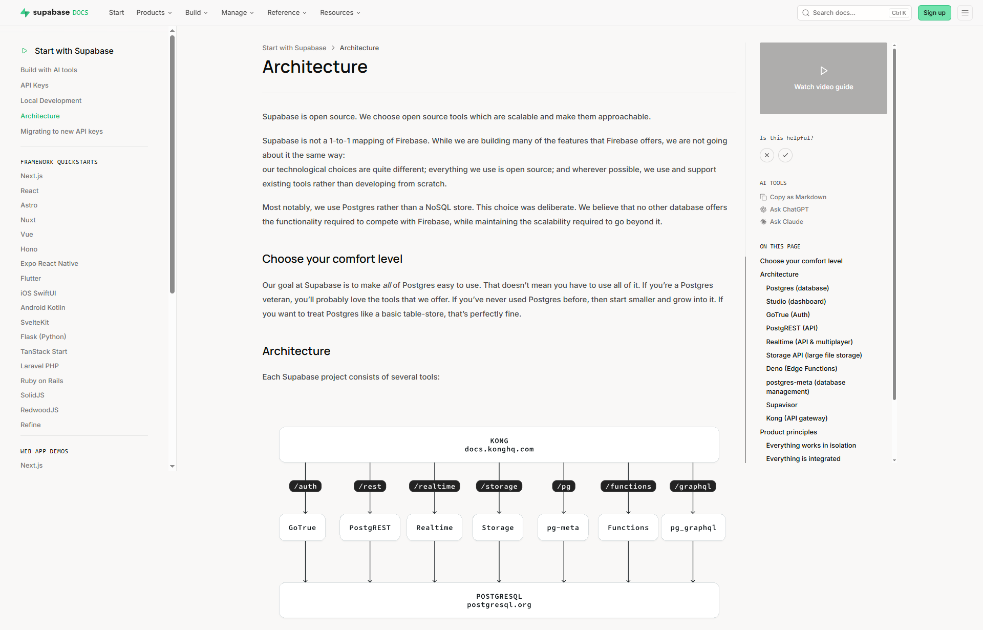
Source: Supabase (supabase.com/docs/guides/getting-started/architecture)
Typographic Precision and Spatial Structure for Technical Reading
True digital editorial design treats technical typography as an art form that directly impacts comprehension. For technology websites, this means deploying advanced layout techniques that combine clean, architectural sans-serif fonts with highly readable monospaced typefaces for code and metrics.
Generous use of white space is intentionally integrated to give the content room to breathe, preventing the interface from feeling like an overwhelming wall of documentation. This careful calibration of type and space ensures that whether a prospective buyer is reading a security report on a desktop or reviewing an infrastructure guide on a mobile device, the experience remains unmistakably premium and precise.
Transforming Your Technical Content
The transition from a standard corporate blog to an authoritative, interactive digital publication requires a willingness to challenge conventional content structures. By treating your technical insights as a canvas for premium design, you can transform static data into an unmissable industry statement that resonates with sophisticated IT leaders.
Thanks for reading!
This article is part of our Marketing Knowledge series, where we share practical insights from our daily work in web design, branding and digital content. If you’d like to explore related topics, see all articles in our Marketing Knowledge section.
Frequently Asked Questions: Interactive Editorial Design
Why are standard corporate tech blogs failing to engage B2B decision-makers?
Standard tech blogs rely on rigid templates that force brilliant insights into uniform, narrow blocks of text. Sophisticated buyers, such as CTOs, CIOs and engineering leaders, deal with daily information overload and suffer from immediate cognitive fatigue when facing uninspired formatting. When a company squeezes complex architecture breakdowns into a flat grid, it unintentionally signals that its ideas are ordinary and transactional.
What is the cost of poor content presentation for an IT brand?
The cost is directly measured in high bounce rates and lost authority. Even with a substantial production budget, high-quality whitepapers and articles will be ignored if they look like intimidating walls of code and text. Without visual rewards, subtle interactions or dynamic changes in scale, you fail to capture the scarce cognitive bandwidth of your prospects.
How do interactive digital editorial layouts solve this issue?
Interactive layouts transform a passive scroll into an active exploration by using guided friction. This approach controls the rhythm of information delivery through: scroll-driven animations that pace the narrative, dynamic data visualisations that make benchmarks memorable and expandable code blocks that keep the interface clean. By breaking down deep technical content into interactive phases, you allow complex ideas to settle before the user moves to the next section.
How does web design signal engineering excellence to a technical buyer?
Technical buyers naturally associate meticulous frontend design with robust backend engineering. A custom editorial layout acts as a visual proof of capability. Investing in bespoke typography, tailored multimedia integration and flawless transitions demonstrates a commitment to operational excellence. The layout itself becomes a silent proof of competence before a prospect ever speaks to a sales representative.
About Black Cliff Media
We’re a UK-based creative agency specialising in video production, website design and development, branding and visual content. Every article we publish is reviewed by our team to make sure it reflects our real project experience, so it is not just theory.
If you’d like to see how we apply these ideas in real client work, check out our latest projects.