The Psychology of Shapes: Why Your Logo Geometry Matters
Take a look at your brand’s visual identity for a moment. Is it too childish? Does it truly speak to your industry or is it perhaps too aggressive? These might sound like strange questions, but the human brain is hardwired to interpret shapes long before it reads words. If you are a wellness brand using sharp, jagged triangles, you might be subconsciously signalling danger or warning to a customer looking for calm.
In branding and graphic design, geometry is not just an aesthetic choice; it is a psychological language. Different shapes trigger distinct emotional responses in the amygdala: the part of the brain that processes fear and pleasure. Understanding logo design psychology ensures that your brand’s body language matches its voice.
The Hidden Language of Geometry
When a potential customer sees your logo, they make a snap judgement about your company’s personality. This happens in milliseconds, driven entirely by the shapes you use. To build an effective visual identity strategy, you need to understand the three core categories of geometric psychology:
1. Circles, Ovals and Ellipses: Community and Unity
Curves have no beginning and no end; they represent wholeness, movement and community.
- The Vibe: Friendly, inclusive, nurturing and approachable.
- Best For: Charities, community organisations, wellness brands and social networks. A circular logo says: “We are all in this together.”
The Olympic rings are a classic instance of interlocking circles, beautifully symbolising global unity and connection without a single written word.
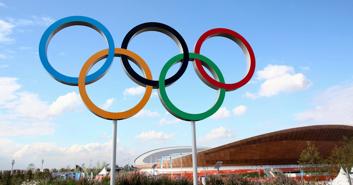
Image source: Olympics.com
2. Squares and Rectangles: Stability and Trust
Straight lines and right angles suggest order. The square is a fundamental building block of architecture, representing the brick, the house and structural stability.
- The Vibe: Rational, stable, professional and efficient.
- Best For: Banks, solicitors, construction firms and government bodies. A square logo says: “We are solid. We are here to stay.”
Companies like the BBC, with its iconic blocks or Microsoft, with its four-quadrant window, rely heavily on this geometry to project enduring trustworthiness and corporate strength.
Image source: BBC.co.uk
3. Triangles: Power and Direction
Triangles possess an inherent focal point and energy. However, they are also the shape of a warning sign or a spearhead.
- The Vibe: Dynamic, powerful, assertive and forward-thinking.
- Best For: Sports brands, automotive companies and modern firms that want to appear sharp. A triangle says: “We are leaders. We move forward.”
The famous Adidas three-stripe mountain format perfectly illustrates this, signalling growth, athletic challenge and continuous momentum.
Image source: Adidas via TheNewsMarket
Designing a Strategic Visual Language
An effective visual identity moves far beyond simply choosing shapes that look attractive. True design depth requires anchoring these visual choices firmly in consumer psychology. Ensuring that a brand’s initial point of contact aligns seamlessly with the target audience’s subconscious is essential for building lasting engagement.
Whether a business requires the soft approachability of a circle or the dynamic power of a triangle, the visual system must do the heavy lifting before any copy is read. The ultimate goal of modern design is to ensure that every structural element serves a clear, long-term commercial objective rather than a fleeting aesthetic trend.
Thanks for reading!
This article is part of our Marketing Knowledge series , where we share practical insights from our daily work in web design, branding and digital content.
If you’d like to explore related topics, see all articles in our Marketing Knowledge section.
Frequently Asked Questions: Visual Psychology
What is logo design psychology?
Logo design psychology is the study of how shapes, colours and typefaces in a logo influence consumer perception and emotion. It helps brands communicate values like trust (squares) or community (circles) without using words.
Why does shape matter in branding?
Shape matters because the human brain processes visual geometry faster than text. The shape of a logo sets the emotional tone (whether friendly, stable or assertive) before the customer reads the brand name.
What do circular logos represent?
Circular logos typically represent unity, community, friendship and stability. Because they have no hard edges, they are seen as welcoming and inclusive, often used by social brands or charities.
About Black Cliff Media
We’re a UK-based creative agency specialising in video production, website design and development, branding and visual content. Every article we publish is reviewed by our team to make sure it reflects our real project experience, so it is not just theory.
If you’d like to see how we apply these ideas in real client work, check out our latest projects.